If anything needed to be refined from the original film that would have to be the animation, at the time not having any prior knowledge on how to do 2-D animation, my attempt of animation was just to sketch out the picture, with a pencil and paper and just photograph it and use that as the final picture in the film, there was a late attempt to make the picture look more unique by adding a sketchy filter on top of the image, just to make it appear more lively than originally was, apart from the ending been in colour the sketches were completely in black-and-white.
The reason why the ending was the only section in colour was because it was a relatively positive ending towards the film, so in order to show that it was less dreary and not like the rest of the short film colour was brought in to show the difference, on how bright and lively his world is now, although I feel that the black-and-white scheme is a rather overused concept for a film, in order to show the contrast in the wilds between the doll and mundane and the bright and lively, I think I wouldn’t be challenging myself enough if I did the same thing twice, so I want to challenge myself into presenting A colour scheme in order to show the difference between the autistic lad life and everyone else’s life.
So I’ve created a five minutes animation test, by digitally tracing over my original sketches from the first school reflection film, creating them into PNG files, i’ve attempted to animate the pictures on using a key frame on my final cut pro software.

Script Writing
Draft One
Script Writing
Draft One

Research
Audience Feedback

Creating the Animation
Once I had finalised the character designs, I began animating the characters so I could start my production. I decided to animate the most important scenes first, so that if anything went wrong during the process I still had these intact. I could then re-use them and really work the animated sequences if needed. The scene I found to be the most important was the one showing the relationship between the student and the teachers because that was the main theme to this film. I wanted to show what can happen to a student with autism without the appropriate support.

Story Board
I began to time myself to see how long the animation took on a daily basis. The first scene I animated was of the main character’s head from a side-angle rotating around to a forward-facing angle. This gave me an archive of different angles if I needed the characters face again. I then had the option to copy and paste the characters face and change their facial expressions. I could then save every picture and put them in a folder so I could use them again. For example, every camera shot of the character facing the audience would be put in a folder called ‘forward-facing’. Every eye animation would be put in a separate folder to show emotion, for example, ‘happiness’, ‘sadness’ or ‘anger’. If I had a new animation of a extreme facial expression I could use these folders to store them in the future. If I had a shot with the character facing sideways it would be labelled ‘sideways’. Essentially there is a folder for every possible angle.


Files and Folders of Animation


Eieys Size

Boiling Lines Animation
For moments which conveyed stress I have two sketches of the main characters eyes. I put these on top of each other and adjust them around frame by frame to give a feeling of movement. This makes the character appear stressed. In the animation there is a scene where the character becomes stressed after arriving late to class. The character copes by imagining a cuckoo clock as it makes him feel happier.

Recycling Animation


Teachers Animation Puppets
School Reflection Blog
(Test VS Final Film)
n order to save time on the animation I re-used an image of the cuckoo clock. In order to give the cuckoo clock some bouncy animation, I stretched the frame of the cuckoo bird out and then down. When the bird goes back inside the clock it returns to its original size. In this cuckoo scene there is a lot of animation re-assembled from the test animation to save time. The original images were re-modelled to give more movement.


Animation Puppet
Animating the Puppet
The secondary character Mrs Sugar has many other different components on her to make up her body. The head, hair, chest, arms, body and skirt are all tailored together to make up her appearance. For example, there are 8 frames of her head moving downwards to add anticipation and only 2 or 3 frames with her head moving upwards to make the action look quite snappy. The head then takes 5 separately cut frames to return to its original position. For the lighter weighted objects on her body such as her hair and chest, they move in a slower frequency to the head. The hair follows the head two frames behind to give an impression of weight. When the head stops moving and the hair catches up, there is one final bounce before settling into the characters main pose. Not everything in the animation is straight-forward, when the character is confused one eye blinks slower then the other.

Blinking Delay
This is a trigger showing the first signs of a panic attack. I achieved this effect by the left eye blinking before the right eye on the timeline and stretching out the clip of the left eye blinking.

Colour Palette


Mrs Sugar Colour
Young Lad Colour
The reason why the main character is a lighter grey then the others in the story is because he didn’t fit in with the other pupils.
In the importance scene where the character is alone with Mrs Sugar, I decided to make the backgrounds and the colour palate a very muddy brown. By adding this colour the school seems more run-down. Mrs sugar is the only character with a bright and vibrant colour. She is red because it stands out and it overshadows the child, this means she has the power. She intimidates him.

Kid's Extras

Lad with the Kid's
Every child in the background has a square face with a lack of detail, making the main character stand out from the rest of the children as he has a round and animated face. This means the character seem rounder and softer giving the impression that he doesn’t fit in to a harder school environment. The characters colour makes him stand out against an otherwise dirty and drab background.

Animating
from
A\B
Ainmating Walking
0:10 gearing up to animate a water cycle
0:18 satisfaction with the animation
Analysing Adam Elliot Flms
0:25 introduction who is Adam Elliott
1:59 what is an Adam Elliott film
3:39 animation quality vs substance
4:40 character animation
5:30 Harvey Krumpet review
Something that I try to avoid animating was a walk cycle this is because if you’re animating walking you need to pay a special amount of concentration on how the characters doing each step, and from my experiences doing walk cycles it was perhaps the most difficult and time-consuming finger I’ve ever animated, and the animation style I was trying to go for was that of Adam Elliott movements, he doesn’t really focus upon creating great and fluid animation is certainly tries to create standout and great summer photography instil shots, and you will still get the impression and the idea of the action is taking place within his own films.


The first encounter with Mrs Sugar
The dramatic sequence between the autistic lad and Mrs Sugar is perhaps the only sequence from the whole animation that has the most action going on with in it, trying to confiscate with the lack of movement I attempted to make up for it with dramatic lighting changes, such as the first time that the autistic lad meets Mrs Sugar, with the young lad placed within a darkroom with the only lights being from an open door when Mrs Sugar is waiting for him, by having a dramatic shadows it tells the audience that something very foreboding scary and dramatic is about to unfold making a rather uncomfortable atmosphere, to illustrate the audience and how uncomfortable young lad is towards Mrs Sugar a notable element I decided to do for the animation was to not give Mrs sugar eyes pupils this was because I wanted to make Mrs sugar seen far more Alien to the audience, to illustrate that the young autistic lad can’t see eye to eye with Mrs Sugar, and to always betray her being grumpy, to be foreboding to the main character as he establish angry faces really makes him uncomfortable.
Element that I really wanted to put into the film for this new animation was to get other group of people speaking dialogue, as I wanted more than just narration to go on, my concerns at the time on completing the animation.
Ttrying to cast other people would’ve took up more time and animating words of dialogue was something I had never done previously so I was unsure as to how much time this would took up of me animating, so I decided that it would be much simpler if it was just narration throughout the video.
Is the main character biting the antagonist of the film a good idea


In order to emphasise on how much more uncomfortable the main character was I decided as a builder for when he has his mental breakdown for the colours in the background to become a darker shade of red with the back from becoming more unfocused, this is to illustrate on how unfocused and how foggy the atmosphere seems to the main character all the small elements building up, this is usually how mental breakdown usually builds up with small elements getting bigger and bigger for the individual into the reality around them is an clear and un focused, originally in the storyboard when he began screaming I was going to animated as everything came to a halt as we suddenly snap back into reality, with all the pupils stopping the teachers stopping, and Mrs sugar the first looking confuse, but then wants glancing to the main teacher, she gets angry face back on right. She would have grabbed the young person and pulled him out the door. His reaction would have been to bite her hand, which would represent the mistake she made in escalating the situation. I did not have the time for multiple shots on this scene so it was edited out. I was fearful that this would lead to a lack of empathy for the main character, which was not the reaction I wanted. Whilst it is not a justifiable reaction to bite someone’s hand, the audience can at least identify with the character and his situation.
Corridor Segment


The next sequence I animated was an earlier scene where the main lead is lost down a corridor. This is the scene which tells the audience more about how his condition affects him. The previous scene shows the character has a very forgetful memory, where he can’t remember the location of his classroom. This illustrates to the audience the severity of his condition. I added a visually element with the corridor shrinking and the end becoming longer and narrower to give the impression of a never-ending journey. At the end of the shot the camera pans round to show the corridor at an angle, making for an awkward shot and emphasising the main characters confusion. A deleted shot I made was of the character walking up to a normal sign and the writing becoming unfocussed to reflect the characters state of mind. This character can’t read therefore the sign is very unhelpful.


The next couple of shots see the character entering a dark room with an unhappy teacher waiting for him. The character decides to act playful to please the teacher but the teacher misunderstands this reaction for silliness causing the boy to have a panic attack. To illustrate the mood of the scene the classroom is all blacked out apart from the main door. The ray of light from the window in the door is small and bright. This illustrates the imagination of the main character, however the rest of the classroom is dark and dim showing that the teacher is in control of the boy. Once the teacher has more control the boy’s light becomes smaller and smaller, until the room becomes a black void causing the boy to hide under a table. With a bright haunting flashing light behind the lad to make the environment seem more uncomfortable.
When characters were moving around between one pose and another posed I try to attend doing jumping animation like I have done in my initial test animation video, but I didn’t feel like that I had fhilly achieve this bouncing fluid animation, at least in terms of transition shots between one pose and another pose probably because at the time I was trying to achieve to get the animation complete as at the time I haven’t completed a five minute animation before in the spans of a couple weeks so is very paranoid on getting it completed, many of the shots instead is the character standing around with the narration taking the audience into the next scene.

functioning of the brain

Silhouette headshot of main character
before effects where applied
Explaining Autism
Illustrations
Finalise Animation


The classroom scene and the corridor scene where the most important scenes to animate as they show how the character struggles in real life. After these were finished I could focus on the scenes that put the story in greater context. They were easier to produce. The beginning sequence involved the narrator describing autism. I firstly animated all the effects concerning with the main character, then I stretched the frame of the first shot extensively. I made it into a silhouette shot and overlaid this with the animation of the brain. I achieved this by having a green cloud over the silhouette of the main character combined both images together and green-screened out the main cloud making a hole for the silhouettes head. I put the animation of the brain beneath this to make it look like you were inside the head of the main character. I zoomed the shot to the inside of the brain and when the narration had finished describing what autism was, I would pan out from the head, the silhouette falls away and I am left with the animation I originally created.
180 Degree Rotation

The next shot was intended to show a 180 degree rotation of the body but the only completed rotated was the head. I had a shot of the head to show a part rotation but I had to flip this round to show the full rotation. The same couldn’t be said about the body is only had a side angle a forward angle and that was it there were no angles in between to complete a rotation animation, but since you could only see the very top of the body, I did some keyframe movements shifting the side body and the forward facing body slightly just to give the illusion that they were moving alongside with the head, to create a complete 180° rotation.

Recycling Animation
Mrs Sugars Eyes
Extras Body
A lot of facial animation was recycled as the faces that I need my main character needed to react already existed, the bullies characters not only recycle the same designs as the rest of the kids in the classroom, but share the same blinking animation with Mrs sugar the only thing that was original about the animation was there facial movements with their mouth smiling. And a very brief short of one of the hands smashing a ants nest.

Animation Frames


Final Film
The anthills with the very few new shorts that had to be animated from scratch for this beginning sequence, with three frames of the anthill one where it’s intact, an in between four when it’s getting destroyed, and the final picture for when it’s actually destroyed, the ants themselves just a quick sketch I did, keyframe one ants movements copying pasting that same animation, slightly delaying each clip to make it look like a small Army of ants was following in a line.
A small bit of new animation had to be remade for a low angle of the main character that being with his stressful eyes.

Mouth and Eyebrow
Head and Blinking
It was from this point that I decided that it would be simpler to animate a simple blinking face without any pupils, and then once I inserted the animation of the blink I could then animate the pupils and eyebrow movements and mouth to illustrate the characters emotions in that sequence.
Although consequently this added in more layers that’s a typical longer for the computer to process the timeline to animate the whole thing, Semite the a few shots we might notice that there is in any mouth, just because it took so long to render through.
Initially with Mrs Sugar design she was supposed to have a mouth but I forgot during development during the animation, but I felt like with the lack of the mouth it made her seem farm more intimidating, so I decided to carry on without giving her a mouth, with the exception of the last time that we see her with a more grumpy face for Mrs Sugar.
Young Lad Body Parts
Legs and feet from high angle
Crouching shot
PE shot

Legs and feet
from high angle
PE shot
Crouching Shot
PE Background

A couple of new bodies had to be sketched out for the main character, being of the leg and shoes for when he’s looking down, another one where he’s crouching down on the floor, and one more where he sat down in a PE uniform. For this background of the PE uniform I wanted to do what pics are usually doesn’t try to place in a few Easter eggs, for previous projects or upcoming projects I would hate to spoil them so I let you lot to try and find them.
Scribbled Animation


Green Screen Scribble

Teacher animation
Another additional character that needed to be sketched out for this opening was a teacher walking on by and looking rather confused at the main boy as he just did a peculiar thing.
I decided instead of creating a new teacher, I would instead recycle the same design of a teacher we previously saw in the corridor sequence.
I just had a few different body parts to make up his structure and frame them for the animation.
For the scene in which I describe the character’s preference for a pencil, in moment the pen is squiggled out I used a previous technique. In my previous Graphics module, I coloured in a layer in green, and used a screen-capture to record myself in the art programme. I then used a black pen to scribble over the green layer and converted the screen captured video into my editing software, removed the green background and overlayered the screen effect on top of the pen animation. This made the pen disappear.
Over the Wall


Animated sequence
Animation set ups
then zoomed onto the image, put the school in the background, panned out and focussed on the main character’s movement. The camera would then pan down on the wall until the character was out of view. I did a still shot of the boy, and animated him moving quickly past the camera. I added a motion blur to emphasise the speed of the character climbing the wall. The character then pops up quickly to show he’s okay. I animated it this way to make the sequence less complicated to film.
In conclusion, this is a grand upgrade from my original film in terms of the quality of animation. I’ve tried to as many shortcuts as I can to finish my film but keep the quality of animation intact. By keeping an archive of the character’s facial expressions, I was able to re-use some footage. I felt like keeping a model sheet of the designs made the animation look more professional. By taking shortcuts I haven’t been able to experiment with character speech or walking, but since I’ve developed my understanding of 2-D animation, this will just be the next logical step. This animation deliberately didn’t use any complex movement making it easier to complete. For my next project, I intend to add more movement to my animation. For now I am happy with the skills I’ve mastered regarding 2D animation.

Reviewing Rough-Cut
Reviewing Rough-Cut
0:02 introduction
0:20 the critics
0:59 audio consistency
1:22 audio fix up comparison
1:36 The original opening
1:57 advice to bring back the opening
2:30 photographing the new opening
3:02 how well it represents autism
3:40 nitpick about line delivery
4:02 fixing up the line delivery
4:18 questioning if it’s appropriate
5:18 expanding upon the classroom segment
6:35 last minute tweaks
6:46 comparisons of new sound affects
7:16 analysing the betrayal of autism
8:04 VR headsets online review
8:24 Conversation online
8:53 elements the online user liked
9:02 reviewing the animation
9:17 reviewing the storyline
After finishing a rough cut of my short film, I showed it two colleagues I work with. One, a member of learning support, the other being a fellow classmate. Together we watched it and discussed what was good about the film and what could be improved upon.
Since it was incomplete I had to remind colleagues about critiques they gave me, such as the colour of the background. It was a green background that could be used as a greenscreen if necessary but they thought it was part of the final background. One point that was made by my colleagues is that I could expanded on the subject of what autism is and explored the broader concept. My video worked for a younger audience as it was simple to understand, if I wanted to target an older audience of 15+, I would need to go into more depth.
My colleague said that my voice during some of the dialogue sounded too high as I was trying to hard to sound upset. I think he is right in the idea that I could make the dialogue more serious. Another comment made was regarding the appearance of Mrs Sugar. My colleague commented on Mrs Sugar’s body shape as he felt it may have been a tad inappropriate for the video. I don’t think it’s overly inappropriate, the idea was that her body shape would give her an intimidating quality but also mysterious, so you couldn’t decide if she was good or bad. In the film ‘the little mermaid’ the main villainess is quite fat so I’m not sure that appearance matters. The character was made seductive to increase her aura and make her seem more sinister. I was considering making another character who didn’t make the final cut. She would have been a good character with round and curvy body shape. This would have been a direct contrast to Mrs Sugar’s character.
The element that both colleagues enjoyed was the classroom scene. The main character is trapped in a busy classroom. Owing to a lack of help of help from Mrs Sugar, the character experiencing a breakdown and runs out. My colleagues liked the animation that showed the main character descending into a panic attack. When the main character escaped the class-room the background descended into colour emphasising that the young man was in control, however when Mrs Sugar dominated the classroom the background was a dark red and it appeared like she was sucking the life out of the scene.
My colleagues suggested improvements to the sequence. I could have added other difficulties for the main character. For example, another pupil could knock on the table in the classroom, which would lead to a build up of tension and a change of mood. The knock would transition into a heart-beat representing the character’s stress levels. They suggested I finish the film and edit these things in afterwards so that I finish within my time frame. Ethan’s rating was 6/10 which meant that he found it okay but James gave it 7/10 and good overall.
Filming location
I went into the main building where I found a room that looked like it was from a hospital. It had a curtain around the bed. The beds though are designed for massage and hair-styling. The room belongs to the hair and beauty department. It has medical supplies and anatomy structures such as body models. I think I may use this to film in because there is a hospital scene in my script. I visited the building with Gemma to see if I could obtain permission to shoot part of my film in there. The Hair and Department were happy with this.
I had my eye on my department for quite some time now as I had always had the idea and Whenever I walk past at Department of filming some sort hospital like setting for a film, so I was very excited to finally have the opportunity to film in the block.
And having the room to myself I spent all morning going through and filming what I felt was necessary.
Once I began filming the necessary shots, I had to adjusting the scenery in the room to get the right lighting. If I was to do it again I would have tidied the room the day before. When I started I could tell the department was just set up to do beauty related work. On each bed there was equipment set up for this. When I inspected the curtains closer I realised I could completely hide the beds. I found that by hiding the beds it made it more realistic because they didn’t look like they came from a hospital. There was only one bed inside the room that came from an actual hospital, therefore I used this bed for most of my shots. The hardest shot was filming myself going through the door because there was nobody else to help film. I started the shot with the camera in the room then I crept out with my foot holding the door open. Once I was out the door I let it close. When I edit the footage I will try and make sure it looks like the door shuts on its own and my camera shot will pan into the room.
Once I sat down began editing out my video it’s would of started in the hospital was small montage as the narration describes as to how exactly I was diagnosed with autism. It’s just during this time before editing the Final Cut together I had a meeting with a colleague and he enquiry mean about if I was going to include what did in my original school reflection film, that was at the beginning of the film there was a small montage of a messy room and eventually the camera carried over to a table with art and crafts, then a book will be placed down with the title’s name school reflection the book would open up and would see the sketches of what will be unfolded in the film, and this would be all photographs in black and white, then by the end of the film we will return back to this Arts and craft table but in colour and the table itself being much more tidier than what it was at the beginning of the film, this was supposed to symbolise on how messy and chaotic the characters life was at the beginning of the film, then by the ending it was supposed to go on show and how much more calmer and the love life his is now, I hadn’t really considered bringing that aspect back into the film, my original idea to the ending was to be the main character to walk into a live action setting for the ducks swans and various other wild animals. But my colleague advise me to replicate something similar to the original opening and ending as he love on what it symbolised, so the next plan was to combine a new opening with the hospital clips, in the segment of the hospital the camerawork handover tour whiteboard and a rough illustration would be placed out with the word autism and a sketch of a brain as would fade into the final animation describing what autism is.
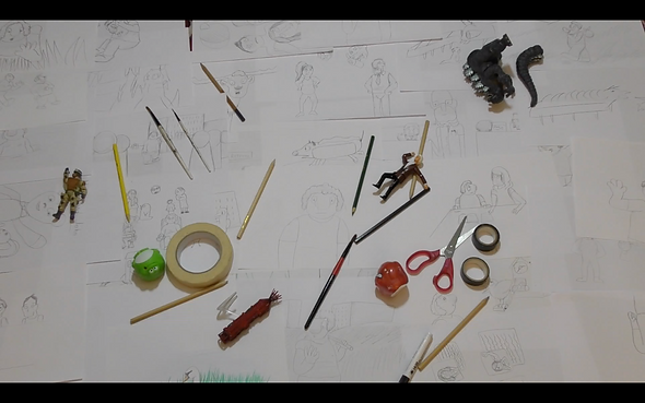
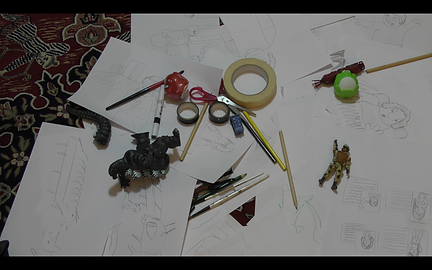
The new opening having all the sketches been placed out with various toys pencils and other art equipment been dotted randomly around the setting was all filmed at my house, and in the sitting room which parents were willing to allow me to filming their patiently.
Since this was so late in production filming this shops I didn’t have time to create new sketches for this opening so I relied on the original sketches from divisional school reflection film to be placed in, I eventually realise that the whole segment at the hospital wasn’t really required as sense the opening already has sketches of paper everywhere that the explanation of autism maestro just taking place in this segment.
So the whole section with the hospital was eventually eliminated out, and the next about filming featuring a colourful sketch done by me and placing the sketchbook back on itself all inglorious colour, along with my pet cats, who was featured at the end of the animation that been very animal that keeps my nerves act calm as cats can be quite comforting animal and pet, that last shot to place on my work desk where I file a lot of my drawings, admittedly I’m not overall pleas or proud of these opening and ending shots as they were quite hastily put together and filmed all within a day without any real planning just trying to replicate on what the original dead, without evaluating of what elements I should keep around a water damaged in work so well back at them for the rest of this film, but at this time I was so is desperate to get the edits done, that it was just a case of just getting everything finished on that day the questions asked.
I think I did discuss a job I did considering that all took place within a day but I think if I had this mind set at the beginning of the project and the time to pass that either other ways that it could’ve been improved upon, or perhaps another idea or solution could’ve been conjured up during that time.


Intended Hospital Location


Original Opening

New Opening


Ending Setup

My Cat Featured at The End
Location Recce Folder

Schedule


Schedule the whole project
I don’t feel that I’ve been very successful into planning out my schedule, as I intended to get the preproduction process completed by March, and then the actual production taking place over April, but instead the way that I’ve planned out my schedule initially was for me to do several things within a day such as getting simple videos done within a couple of hours before moving on to the next thing but had to get done, meanwhile planning out some of the videos that we will be doing at the term, by attempting to do this I overpacked myself with too many projects and wants to do in one day, and being somebody whose perfectionists I want to make sure my quality of work was the very best it could be, so small talk interviews I intend to do while doing the project Took me up to a couple of days to complete for me to be happy with them, and oh so that plan on working on several other projects while all my FMP backfired in a horrible way as there was not easily too much focus upon on my own Final major, after seeing on how stressed out I was my tutors sat me down and told me that not one person is working on three projects at once, and just focus on my FMP, but unfortunately by then it had been slightly too late as I had planned a holiday where I would so mount some elements for other projects, and given how the likelihood of me returning to set holiday was unlikely I had to get some filming done.
I think ideally I should of just focus on my FMP as a whole and get all the preproduction staff such as research and interviews done with in a span of 2 to 3 weeks that would’ve been in April and I could get each interview filmed with then one week then for the videos edited within a week, then the research within another two weeks and that would’ve took another March.
As for the actual production of my video I ideally wanted to do it from the majority of April and at the time of writing this in April I have been able to complete nearly Half of the animation, something I should’ve reflect upon doing my animation test earlier was to see on how long it was going to take me to do up-to-the-minute of animation by timing myself then I could properly and expertly put down as to how long it takes me to do an minute of animation, but I think now knowing how long it takes me to do each process such as taking a week to do eight interview video in terms of editing and for animation knowing it takes me about day to do about 30 seconds worth of animation, I’ll be able to much more ideally plan out has to how long each process will take me and how to accordingly planet out in schedule, I think planning out in the schedule has always been one of the elements I have majorly struggled with as I mainly a person that likes to get stuck into things and like doing it at my own pace, but I do understand the necessities of schedules as not only shows evidence of what I’ve been accordingly doing each day, but it oh so helps out with a system as to the most important necessity task of the project that first needs to be handled with.
I think been unable of keeping up with my schedule it had a so messed around with me creating my video blogs a weekly series I was going to keep up with in order to record the progress of where I was with the project, because always been behind schedule I was uncertain if I should create a video blog regardless I at least carry on and try to get back on track with the schedule this crater backlog of going backwards and forwards backwards and forwards.
Oh so in terms of pricing and work because I’m not that great of reading and writing I was greatly fearful of doing the writing independently as I would be unable to fairly proof read as to what I’ve written down, making the writing appears somewhat as a mess but with the learning support staff unable to cabin as often as I need them to, it made me increasingly worried about the quality of my writing, in the end I decided that its Best writing with not so neat handwriting and spelling then no writing at all on my progress.
I am not personally proud of my work progress over the FMP but I do hope that I can take from what I’ve learnt here and apply it to my next projects upcoming, and as they always say it doesn’t matter what happens behind the stage but it is what is onstage that counts, so I hope it’s not too late.

SoundTrack
Schedule Documents Folder
BTS Audio Music Track
0:00 introduction
0:10 ambitious goal
0:38 why the fascination of being original
1:09 apps I use
2:36 my new music toy
3:47 which tracks where solely created for the short film.
4:33 where did I get a lot of the sound affects.
4:58 my 12-year-old self voicing the character.
5:34 when I didn’t had a sound affect to place in.
My previous ambitious projects in the past had you often relied on using already established assets and copyrighted content, by either being the foundations of an idea, or using element such as a character or a piece of music to drive home the story and therefore feeling of the atmosphere, since this time round what I have done is an original story with original characters I created, I decided to go next step further and create everything original from the ground up, that would include the soundtrack to the film which I have never done previously before, there was a small but you test I did a couple months back what an animation where I had created the music, but never from a full video project.
The reason why I wants to go into this direction was because I’ve recently had an ambition to start entering my into film festivals, and something that film festivals absolutely required for any film to be entered, is for the individual to have permission for using any copyrighted material, or every element created with in the video is that of the artists own creation, and I have most recently Stumble Upon some free to use sound instruments available for MAC devices which is the software I personally use, so I decided to go out and create my own music and my own soundtrack for this film.
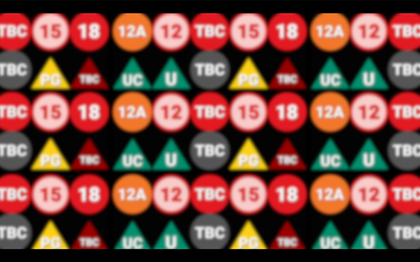
Age Rating
After completing my short film I wanted to see as to which turn of age rating it would be classed in, if I had ideally stuck with my intended audience that being teenagers with in education, I first had a rough guest as to which age class the film could be classed in then go on from there and have a look up to the facts to confirm my own speculation.
Bad language
I first determined that my film was a U rating, this is because I noted there wasn’t really anything of subject that was inappropriate for a younger viewer to watch, even though been set in secondary school where is often common to hear a lot of talk that you wouldn’t say in front of your grandma, the film had avoidance of any bad language as such, in the original school reflection film there are a couple of jokes made about the young lad coming across some gentlemen literature, but through the advice of my review screening and what possibly could be improved upon, one of my colleagues mentioned that while he found the sequence funny, he felt like it was somewhat tad out of place so this film I decided to view things from an innocent point of view and where’d ovoid using any grown-up language as such, but I was always open up to the possibility of perhaps if there was a moment where the character was vulnerable awesome dramatic or some think heartbreaking would take place, some extreme words maybe used but only to emphasise that moment I would only be along the range of PG or 12, but such bad language was never used in the final film.
According to the bbfc websites which gives age ratings in the UK I quotes (• Language – At the most there may be occasional very mild bad language.) Which there was none of so I can take that one off the list.
The BBFC sit https://cbbfc.co.uk/u
Horror
In terms of horror in the short film there are several bets where the young lad has a panic attack, or is overwhelmed.
And the music and colour scheme dramatically changes to reflect this, usually been something of a darker nature. These segments are very few and far in between, and only last for a couple of seconds at the most, maybe 30 is perhaps the longest any of these last.
Reflecting back to bbfc websites, I quote (Moments with ghosts, witches and monsters should be over quickly and not be too scary. Nothing at U should really frighten or disturb young viewers. The film or DVD should tell children that everything is okay.)
What’s the are rather brief and usually situates around teachers and other children, one brief clip featuring what is mention a bit of lava, but only for about five seconds so I think the film is suitable in that aspect of a U rating.
Violence
This was perhaps the hardest one that I could try to rationalise in the entire film, as there is no violence apart from one scene where the young lad is cornered off and is trapped by a teacher, he was poorly handling the situation of keeping him calm, once the teacher tries to grab the young lad by his arm violently, the young lad bites the teacher and runs off. Referring back to the website once again I quote (• Dangerous Behaviour - There should be no dangerous behaviour that can be easily copied by young children) and biting a individual is something that can easily be replicated by a child, so far a moments I was considering a PG rating, but then look at the PG section on website I quote (Violence and Threat - There can be stronger violence than at U, but without detail. Violence which takes place in a comedy, fantasy, or historical film may be treated less strictly.)
Biting people is still not a good thing to do but it’s not a man is an extreme violent act, contemplating this with my teacher he agreed with me, oh so there was a concern from some of my other colleagues that Mrs Sugars big chest could have possibly made a PG on its own, but my teacher said that I could just maybe get away with it in terms of the stylistic lurk.
And according to nudity on the website once again to the U rating I quote (• Nudity - There can be occasional glimpses of people who have no clothes on, as long as they are not linked to romantic activities)
And nobody acknowledges Mrs Sugars body so I think I can get away with the overall look.
So in conclusion I think I can safely confirm that the film is a U rating suitable for general audiences of any age, while it was intended to be aimed at teenagers, so it wouldn’t of mattered if the film was a 12 or a PG, that is an added bonus that now it’s a film that anybody can watch.
Advertisement

School Reflection poster Poster
The poster that I created I got influenced by traditional movie posters, but then one post I try to replicate was the merry max poster, on how minimalistic simplistic the post poster is, that’s my poster I want to add a bit mysterious nature to it, so I decided to have Mr sugar just partially out of frame
What I initially wanted to do as a part of advertising was to crave several trailers but done in the style of the decade, such as one trailer been set in the 80s I never once in the 90s etc etc, but in the end because of my busy schedule I only had time to do two trailers one from the 80s and one from the 2000s, the 90s trailer was planned out and even looser it was written out, but that one unfortunately never saw the light today.
The 90s trailer was originally going to be done in the same style as Walt Disney film trailers, building up on how great and marvellous I was on crating content just like how Disney presents himself as being a film company that can do no wrong, the trailer like to admit that this needed was the hunchback of Notre Dame, where in that trailer the several bits of animation that had yet to be fully completed so it seems rather jarring on seeing on how hard though it is the animators work and then seeing the incomplete animation, I thought that would be a wonderful base to make a parody trailer out of, I would’ve deliberately come back to my animation and try to reduce the quality making it look like they were still in the rest stages of animation, along with a cheesy narration on top unfortunately I didn’t have time to fully realise and create this trailer.
The Dialogue for the 90s Trailer
Have you ever wandered what it’s like not to ‘fit in’?
Have you been told that your some-how ‘different’
Is it you that’s the problem, or is it your school?
Well welcome to ‘School Reflection’, starring one beculiar student in a wacky world!
From the creators that brought you ‘the badger road safety film’ and ‘The Boxes’
Bringing you ‘School Reflection’, rated U, in cinemas Monday

Mary and Max Poster
2000's School Reflection Trailer
School Reflection Trailer 1980s
The Hunchback of Notre Dame - Sneak Peek (from Pocahontas 1996 VHS)
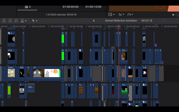
Final Edit
Final Film
Audio Commentary
1:06 Opening addition
1:26 deleted short
2:36 The floor is lather
3:08 scribblings sequence
3:28 sound effects
4:24 Mrs Sugar
4:50 cutting corners on the animation
5:20 keeping it original
5:38 concerned well animating a segment
6:08 animating the ending